Tooltip
The Tooltip component appears as a popup design providing a short text description of information about a feature when the user hovers over the item.
Developer Documentation
Information on how to implement this component is available for the following technologies.
Usage
Use Tooltip when the feature needs to be explained in further detail to walk users through a specific action. It helps to draw the users' attention to a feature without interrupting their workflow. They can currently only be used on icons. They can be used on icons next to any feature such as icon buttons, inputs or tables.
- Appears when a user hovers or focuses on the Tooltip icon.
- Remains visible if the user hovers off of the icon onto the Tooltip.
- Can be toggled open by clicking or tapping on the Tooltip icon or with the Enter or Space keys.
- Remains in view until the component is no longer hovered or focused.
- Can be dismissed with the Escape key on the keyboard.
Guidelines
- Information should be discrete, short and concise.
- Do not use as a warning or alert.
- Do not include links or launch modals from a Tooltip.
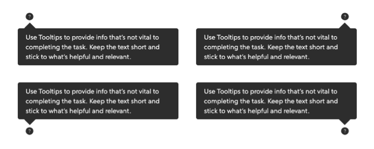
Anatomy
- Content within Tooltips must be text-based with a maximum character count of 140.
- The maximum width of Tooltips must be 290px.
- Text should be wrapped when the content is wider than the max width.
- The position of the design changes based on how close the feature is to the screen's edge such as:
Accessibility
Tooltips are discoverable and operable by users that rely on a diverse set of established navigational means. Also, in compliance with 1.4.13: Content on Hover or Focus WCAG rules, we make sure that any content appearing on hover or focus is dismissible and persistent.
- Must be accessible by mouse, pointer devices, keyboard-only, screen reader, zoom software and any other assistive technology.
- Allow the mouse to easily move over the Tooltip without dismissing it.
- Complex content should be browsable line by line using screen readers.
- Always include a visible label within UI controls.
- Interactive elements must be reachable using keyboard.
- Tooltips use
aria-describedbyandidto establish a relationship between the trigger and content for screen readers and other assistive technology. - Tooltips use
aria-hiddenso they are unreachable by screen readers when the Tooltip is not expanded. - Add text alternatives to icon buttons to express action user is taking.